


DESIGN SYSTEM SERVICES
Design systems that turn product consistency into delivery speed.
AppsLoading creates scalable design systems that connect brand, product design and frontend engineering. We structure foundations, design tokens, Figma libraries, coded components, Storybook documentation, accessibility standards and governance into one maintainable product system.
✓ Figma + coded components✓ Tokens + theming✓ Storybook documentation✓ Accessibility + governance
ConsistentOne language across products and platformsReusableDesign and code components built to alignGovernedOwnership, contribution and release rules teams can follow
FoundationsDesign TokensFigma LibrariesComponent APIsStorybookAccessibilityMulti-brand ThemingGovernanceAdoption
SYSTEM ANATOMY
A design system is not a UI kit. It is product infrastructure.
The system has to connect visual decisions, interaction behaviour, reusable components, code contracts and governance. If one layer is missing, consistency usually depends on memory instead of the system.
01
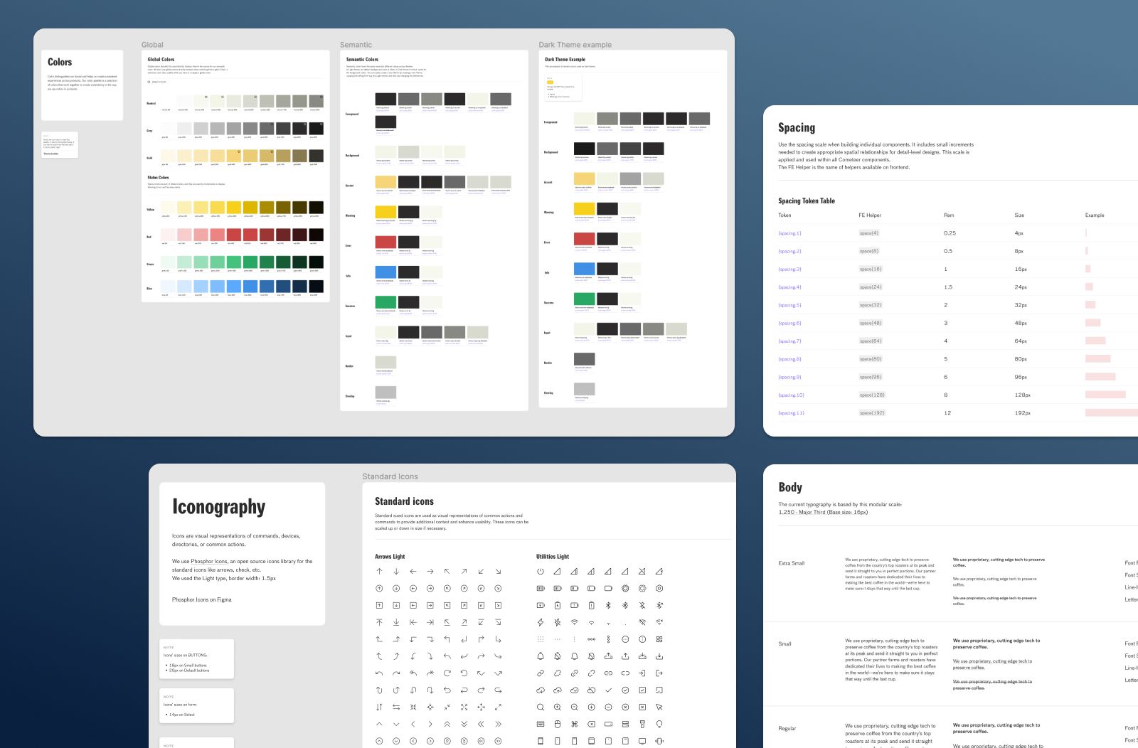
Foundations define decisions.Colour, typography, spacing, radius, elevation, motion and content standards.
02
Components encode behaviour.Variants, states, responsive rules, content constraints and accessibility.
03
Governance keeps it alive.Contribution, ownership, versioning, migration, release notes and adoption.
PRODUCT SYSTEMDesign ↔ Code
DESIGN SYSTEM SERVICES
Build only the system your organisation actually needs.
A focused component library and an enterprise multi-brand system should not be scoped the same way. We shape the engagement around product count, team maturity, frontend stack and adoption risk.
01 / StrategyAudit · maturity · roadmap
Design system audit and roadmap
Inventory products, duplication, accessibility gaps, existing code and ownership before deciding the system architecture.
02 / FoundationTokens · variables · themes
Tokens, variables and visual foundations
Create primitive, semantic and component-level decisions for colour, typography, spacing, radius, elevation and motion.
03 / DesignFigma · variants · auto layout
Figma component library
Responsive components with properties, variants, states, content rules and examples that designers can actually use.
04 / CodeReact · Vue · Angular
Frontend component library
Production components aligned with design names, properties, interaction states and accessibility behaviour.
05 / DocsStorybook · docs · QA
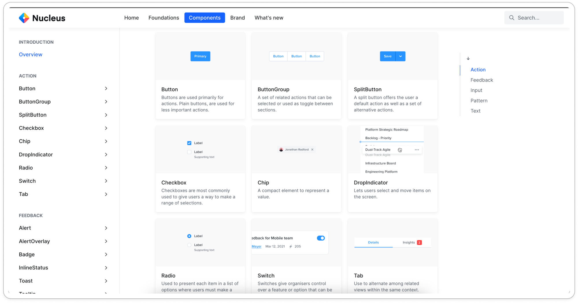
Storybook and system documentation
Document anatomy, usage, states, accessibility, implementation guidance, anti-patterns and examples.
06 / ScaleTheming · governance · adoption
Multi-brand theming and governance
Support brands, themes and regions while defining contribution, release, migration and adoption workflows.
TOKEN ARCHITECTURE
Make every visual decision traceable instead of duplicated.
A scalable token system separates raw values from meaning and component usage, making themes and global changes safer to manage.

COMPONENT LAB
Design every component as a small product contract.
Buttons and inputs are easy. The real work is defining properties, states, content rules, responsive behaviour, accessibility and code parity so the component remains predictable across hundreds of screens.
COMPONENT SET / CORE UI48 variants · 8 properties
Default valueValidation error
Notifications
NameStatusRole
Amara KhanActiveAdmin
Ravi MehtaInvitedEditor
Lisa ColeActiveViewer
DESIGN ↔ CODE CONTRACT
One component language from Figma properties to frontend props.
Design-code drift often starts with naming. We align properties, states and behaviours so the library becomes a shared interface between design and engineering.
01
Shared namingVariant and prop terminology maps cleanly across design and code.
02
Shared statesFocus, disabled, loading, error and responsive behaviour are documented once.
03
Shared release logicDesign and code versions move together instead of drifting silently.
FIGMA / COMPONENT PROPERTY
Button
Hierarchy
Size
State
Icon
Input
State
Message
CODE / COMPONENT API
hierarchy="primary"
size="md"
loading={false}
icon={ArrowRight}
>Continue
// states
focusVisible: token.focus.ring
disabled: token.opacity.disabled
radius: token.radius.control
hierarchy="primary"
size="md"
loading={false}
icon={ArrowRight}
>Continue
// states
focusVisible: token.focus.ring
disabled: token.opacity.disabled
radius: token.radius.control
ACCESSIBILITY SYSTEM
Make accessibility a component property, not a launch checklist.
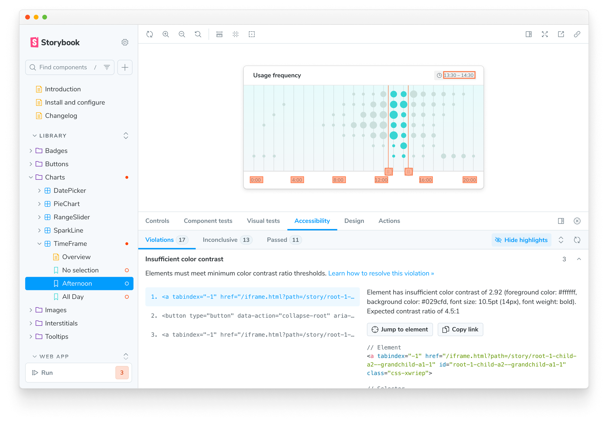
When focus, semantics, contrast, keyboard behaviour and error states live inside shared components, teams do not have to remember the same requirements screen by screen.
✓
Focus-visible statesDefined and testable across interactive components.
✓
Keyboard interactionExpected behaviour documented with the component.
✓
Semantic structureRoles, labels and status communication stay aligned with implementation.
✓
Contrast and themesToken rules protect readability across light, dark and brand modes.
MULTI-BRAND THEMING
One component model. Different brands, modes and markets.
Semantic tokens let the same component library express multiple visual identities without duplicating every component set. That makes brand expansion easier to govern and safer to maintain.
SYSTEM DIRECTIONS
Different organisations need different levels of system maturity.
These are three common directions: stabilising a growing product, unifying several brands, or connecting design and code for an enterprise platform.

PRODUCT SYSTEM
Move from scattered UI decisions to one reusable product foundation.
Ideal for a growing SaaS or mobile product where inconsistency and repeated design work are becoming expensive.
MULTI-BRAND
Scale themes without cloning the library.
Token architecture for products, brands, regions and modes.
ENTERPRISE PLATFORM
Connect component governance to documentation and code.
For larger teams that need reliable contribution, release and adoption workflows.
GOVERNANCE + ADOPTION
A design system only creates value when teams trust and use it.
Governance makes change predictable. Adoption makes the system worth maintaining. We define both so the library can evolve without turning into another abandoned internal project.
01Shared owner model
02Contribution path
03Release cadence
REQUESTIntake
Problem or component proposal
Document the use case, evidence and gap before creating another pattern.
REVIEWApproved
Design + engineering review
Check reuse, API shape, accessibility, naming and migration impact.
BUILDIn progress
Figma and code move together
Create variants, stories, tests, usage guidance and migration notes.
RELEASEPublished
Version, publish and communicate
Ship release notes, package/library versions and adoption guidance.
LEARNOngoing
Track adoption and gaps
Use product feedback, analytics and support signals to improve the system.
WHAT YOU RECEIVE
A system your teams can use, maintain and extend.
Deliverables are structured around the maturity and scope of the engagement rather than a fixed checklist.
01 / Audit
Inventory and system roadmap
Coverage, duplication, accessibility, code alignment, priorities and phased rollout.
02 / Tokens
Foundation and token architecture
Primitive, semantic and component tokens with modes, naming and documentation.
03 / Design
Figma library
Variables, components, variants, properties, states, responsive rules and examples.
04 / Code
Production component library
Frontend APIs, packages, tests, accessibility behaviour and release structure.
05 / Docs
Storybook and usage guidance
Anatomy, do/don't guidance, examples, accessibility and implementation notes.
06 / Governance
Ownership and contribution model
Review, versioning, release, migration, adoption and ongoing maintenance workflow.
No generic “100-component” promise.The right system is the smallest reusable foundation that reliably serves your real products and teams.
DESIGN SYSTEM PROCESS
From fragmented UI to an adopted product system.
We build in stages so the team can validate architecture and adoption before expanding component coverage.
PHASE 01
Audit product reality
Review products, Figma libraries, frontend components, accessibility, duplication and team workflows.
PHASE 02
Define foundations and architecture
Agree tokens, naming, component boundaries, API language, documentation and governance.
PHASE 03
Build the high-value core
Create the components used most often and prove the design-code workflow with real product screens.
PHASE 04
Document, test and migrate
Add accessibility, examples, stories, tests and a migration path for legacy patterns.
PHASE 05
Launch, train and govern
Publish the system, onboard teams, measure adoption and establish contribution/release routines.
What is a design system?
A design system is a shared collection of principles, foundations, reusable components, patterns, documentation and governance that helps teams create consistent products.
How is a design system different from a UI kit?
A UI kit mainly contains reusable visual assets. A design system also defines behaviour, code alignment, accessibility, documentation, contribution and ongoing governance.
Can you audit an existing design system?
Yes. We can review component coverage, duplication, naming, accessibility, design-code alignment, documentation, governance and adoption.
Can you build a complete Figma library?
Yes. We can create variables, styles, components, variants, properties, responsive behaviour, states and usage examples.
Can the system support multiple brands or themes?
Yes. Token architecture and modes can support multiple brands, light and dark modes, regions or product-specific themes without duplicating every component.
Can you migrate old screens to the new library?
Yes. Migration can be phased around product priorities, component coverage and the risk of changing legacy workflows.
Can you build coded components too?
Yes. We can create frontend components with aligned naming, properties, states and behaviour for the chosen product stack.
Do you provide Storybook documentation?
Yes. Storybook can document examples, states, controls, implementation notes, accessibility guidance and component behaviour.
Can components be published as reusable packages?
Yes. Package structure, versioning and release workflows can be designed around your repository and deployment model.
Do you include accessibility?
Yes. Accessibility can be built into component states, focus behaviour, keyboard interactions, semantics, contrast, content guidance and testing.
What are design tokens?
Design tokens are reusable variables that represent decisions such as colour, typography, spacing, radius, elevation and motion.
Can tokens connect design and code?
Yes. A shared token model can improve consistency between Figma and frontend implementation, especially when naming and semantic roles stay aligned.
Do you provide governance and adoption support?
Yes. We can define ownership, contribution, review, versioning, release, onboarding and feedback workflows.
Who should own the design system?
Ownership often spans design and engineering, with clear product or platform accountability and an agreed contribution model.
Can the design system evolve after launch?
Yes. A healthy system evolves through product needs, contribution requests, accessibility improvements, usage feedback, versioning and measured adoption.
READY TO CREATE ONE PRODUCT LANGUAGE?
Build a design system that helps teams move faster without losing quality.
Share your product ecosystem, current Figma files and frontend stack. We’ll map the system architecture, highest-value component coverage and rollout path before the build begins.
Figma architectureDesign tokensCoded componentsGovernance

DESIGNone shared product systemCODE